

|
John Rankin Waddell was born in 1966.He was also better known as Rankin. He was born in Paisley and brought up and grown up in St Albans Hertfordshire. He is a photographer who specializes in portraits and fashion photography. He then went on to married a super model and still takes pictures of her today. Rankin is also a British portrait and fashion photographer.
|
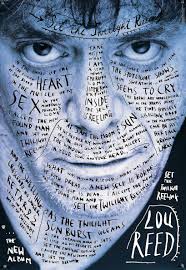
some examples of Rankins work.
|
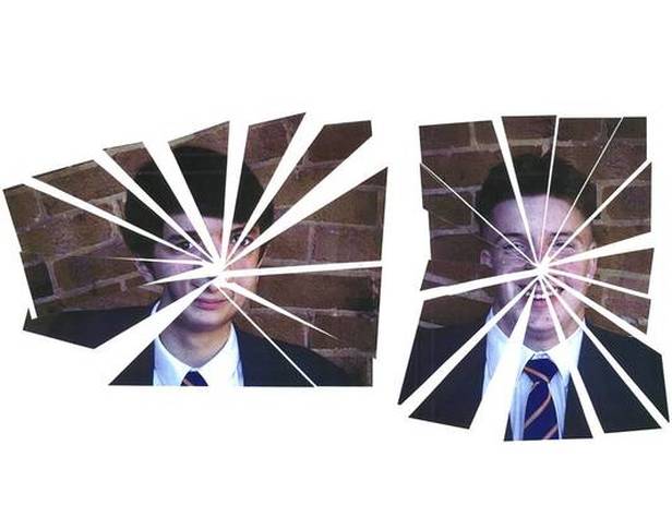
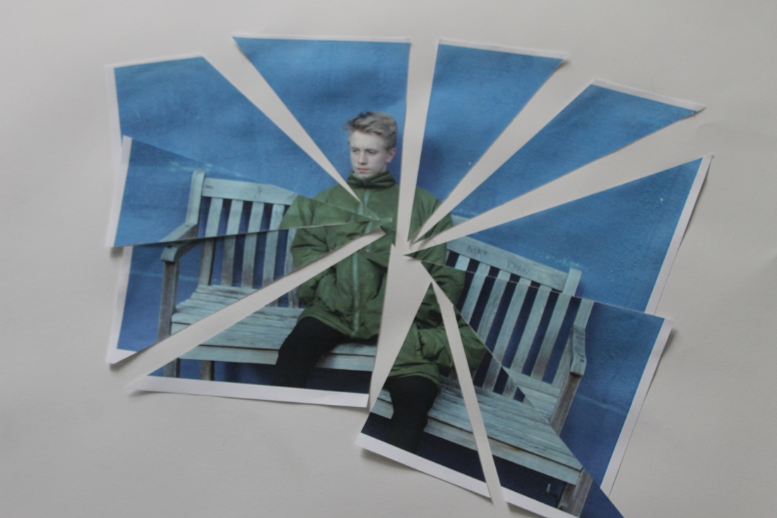
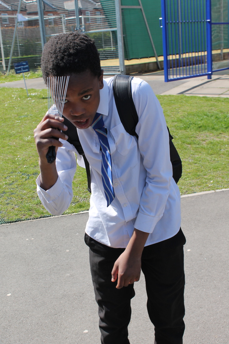
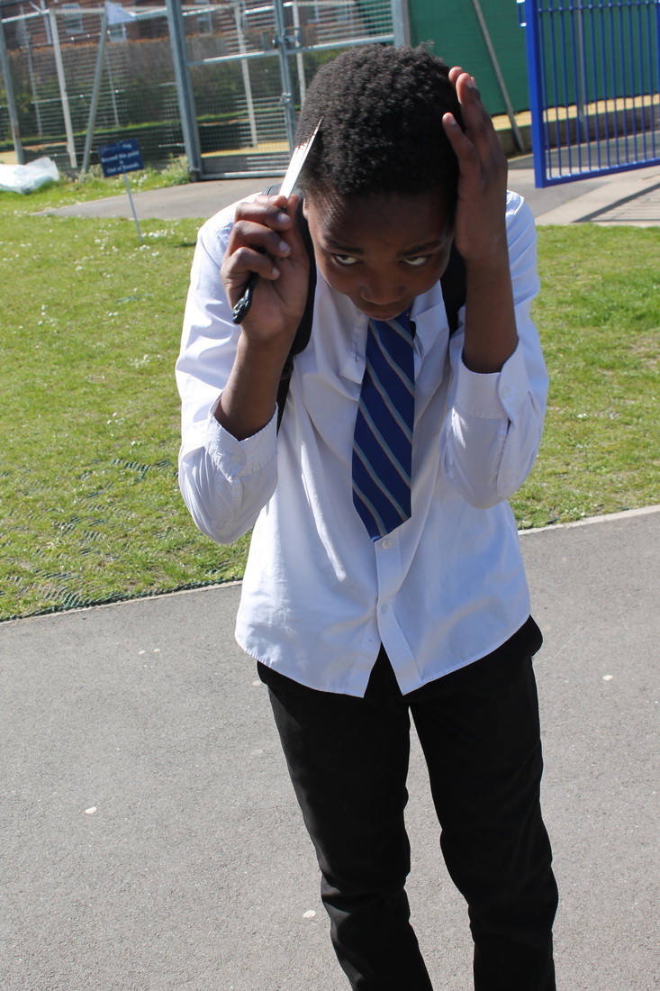
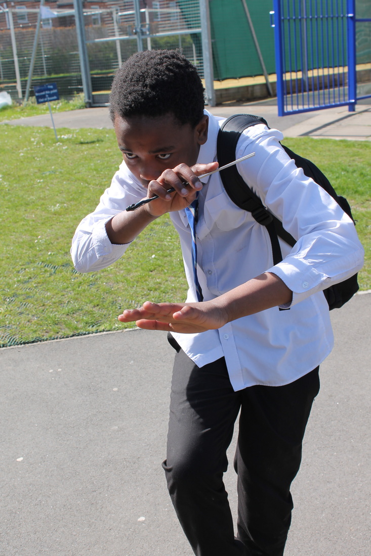
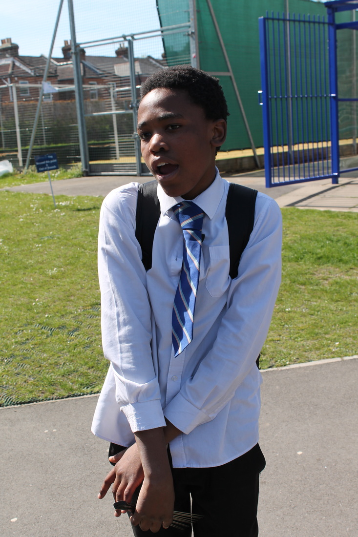
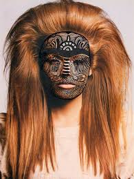
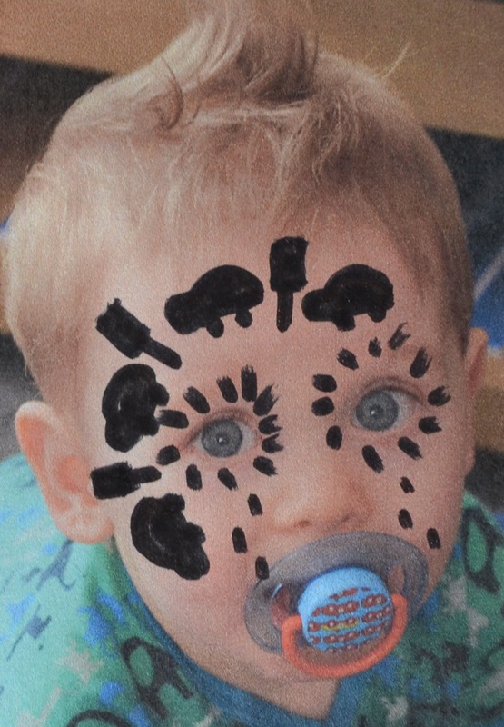
Rankin destroy examples
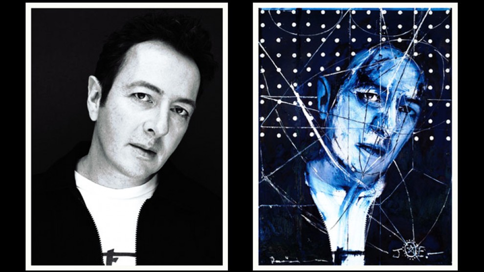
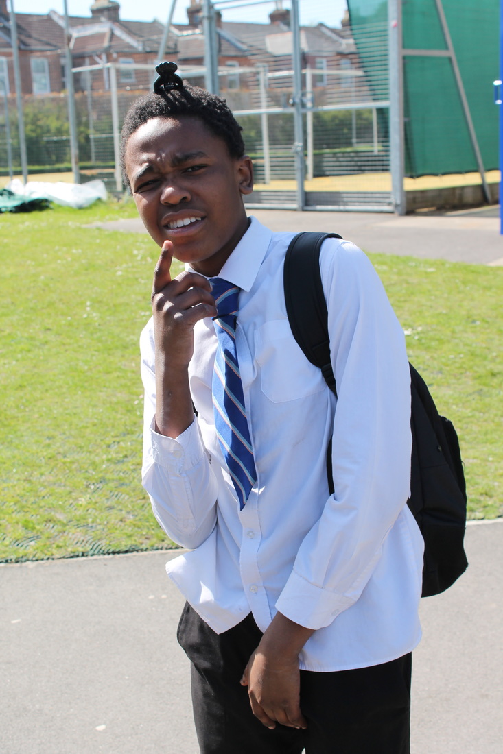
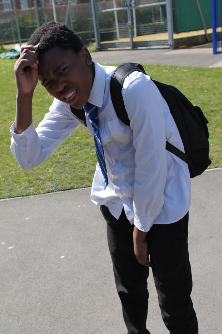
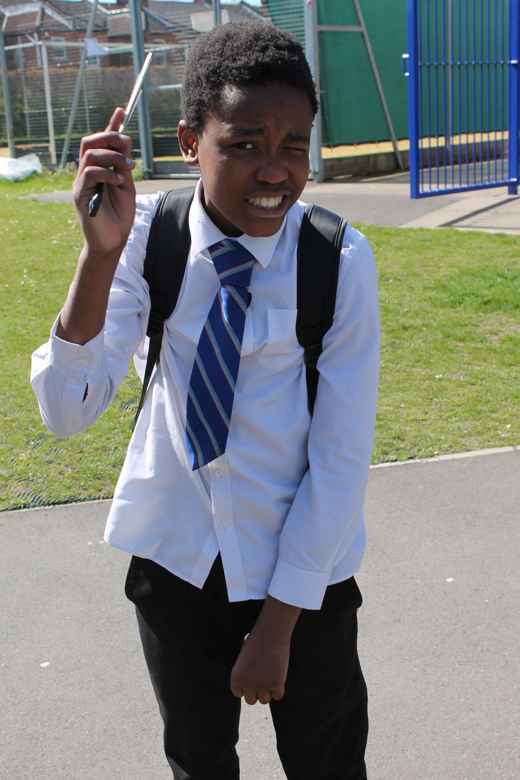
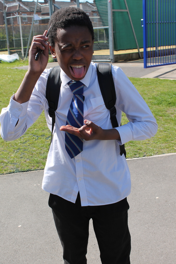
Rankin destroy response
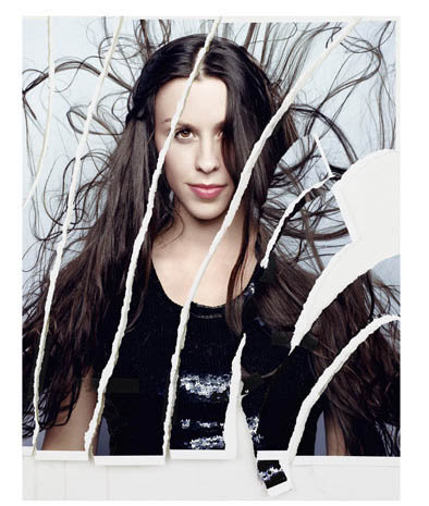
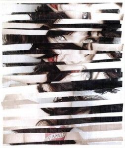
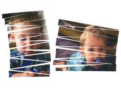
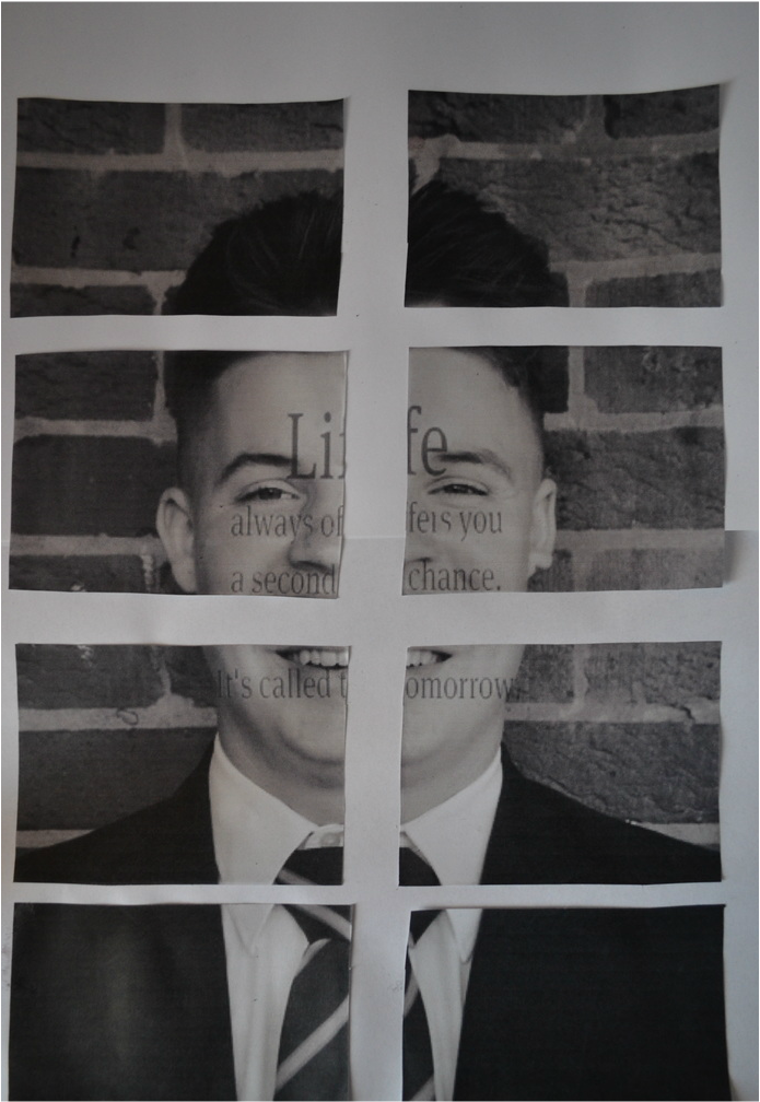
This is my attempt of recreating Rankins destroy images. To create these images i had to print each one out and using a craft knife to cut each one up and recreate the image by stick the parts on an A3 size paper and once finished i scanned my photos back onto the computer and put them on a clear white background. My Favourite images are the baby ones because or though there are meant to be cut up they both have a nicely placed order and you are allow to clearly see the subject unlike some of my other attempts at this.
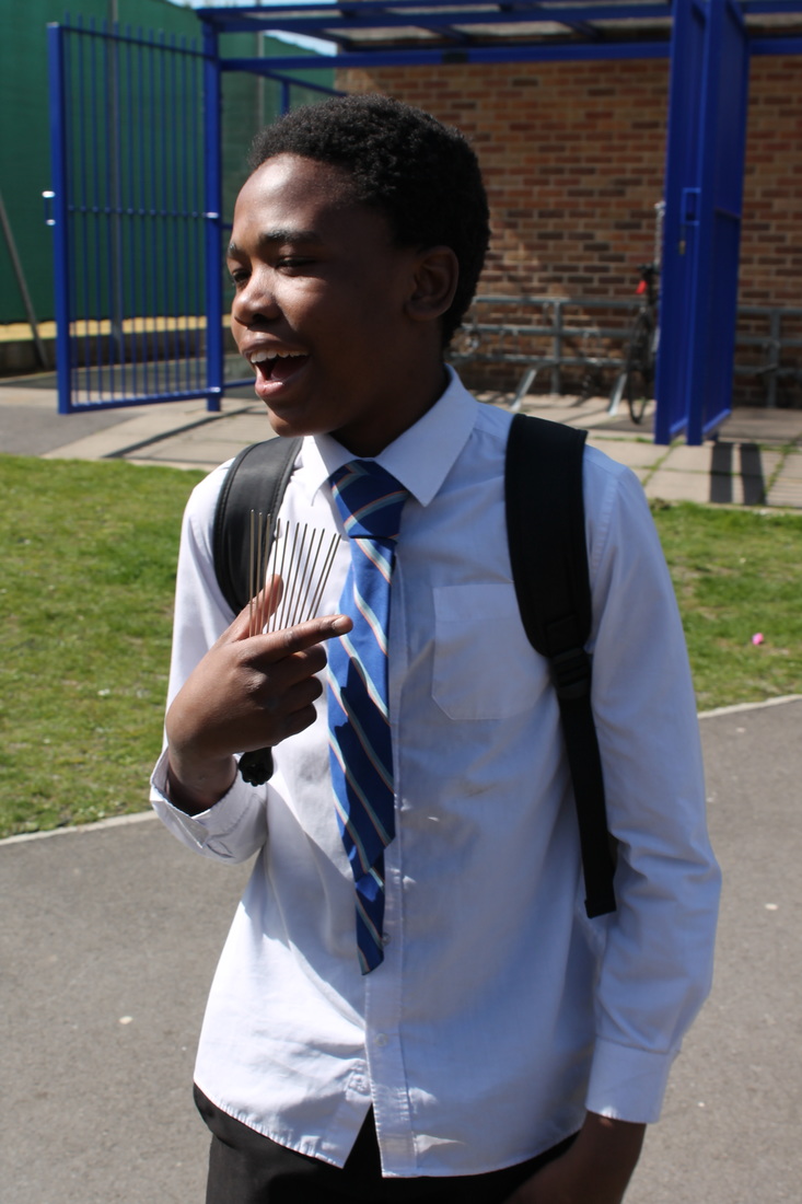
my favourite photo by Rankin

This is a photo taken of the queen. This is my favourite because you very rarely get a chance to photograph the queen, also it is very rare to see the queen smile and to see her as happy as she is there. The way Rankin has taken this photo he has used a short depth of field. This is because this is a portraits which is normally taken as a close up. She is also wearing pink lips stick to make her stand out more .The one thing I would change is the lighting. I think that there is way to much light being though at her. This is a problem because I feel that it drains the colours out.
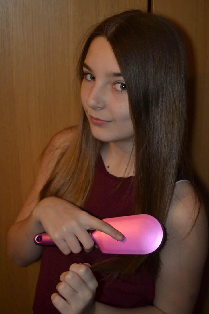
holiday photo-shoot
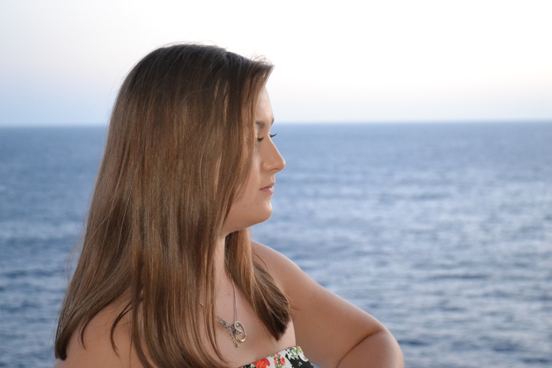
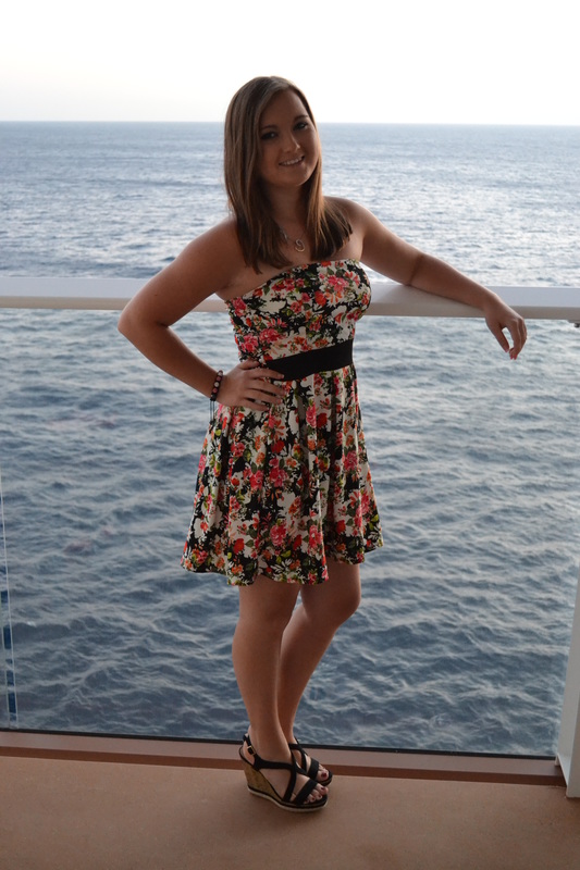
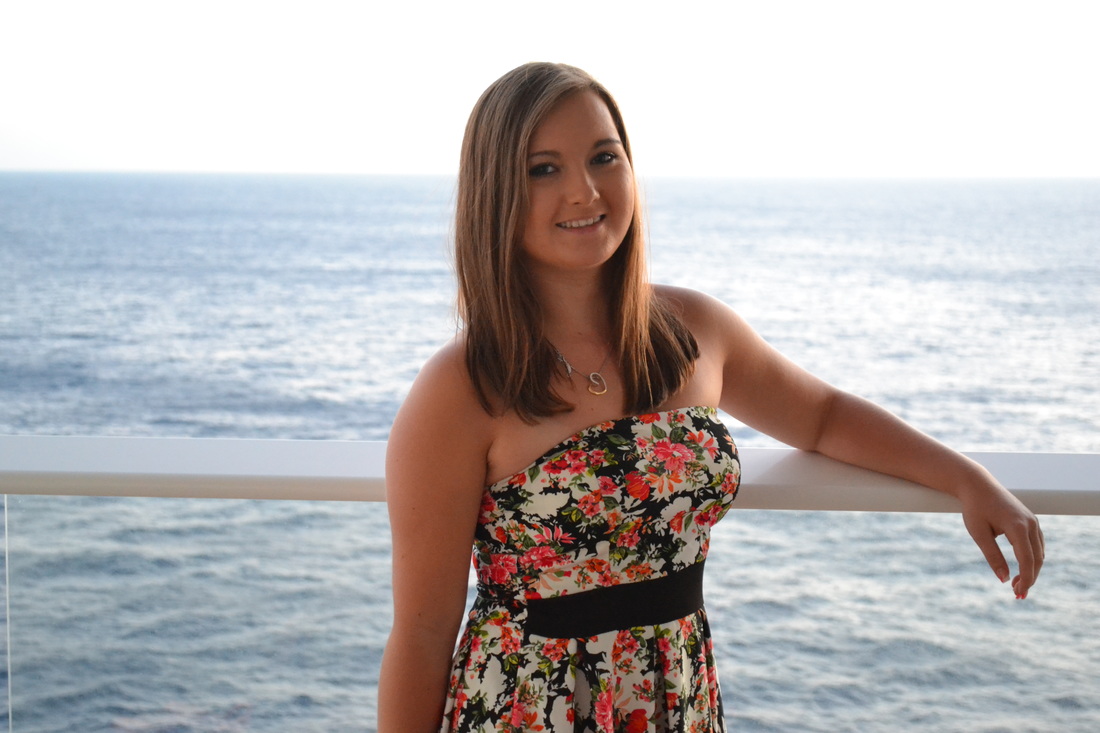
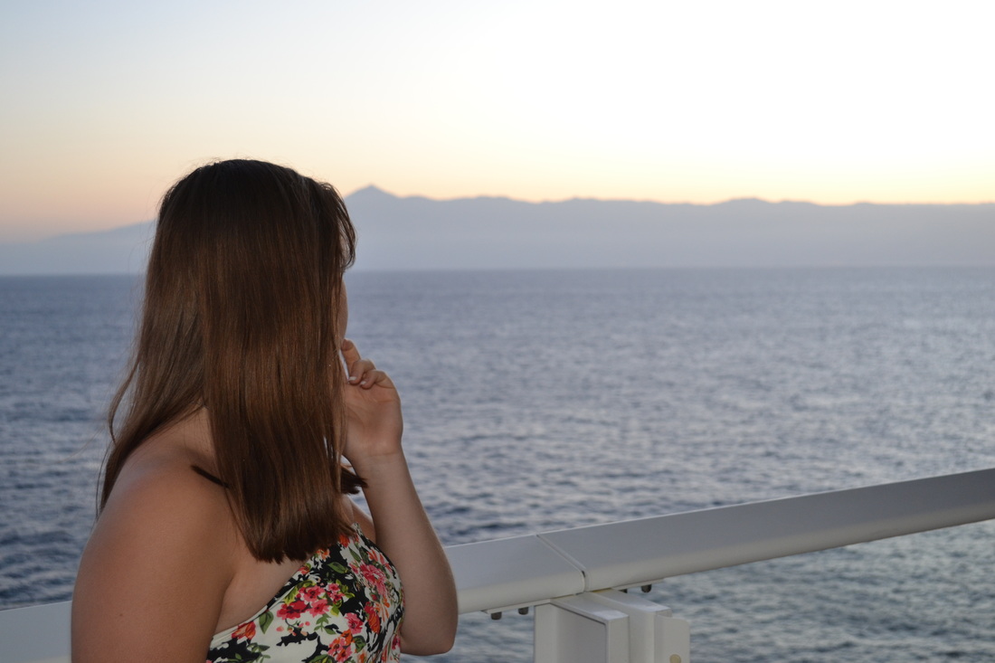
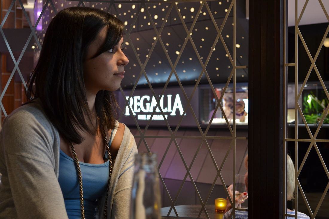


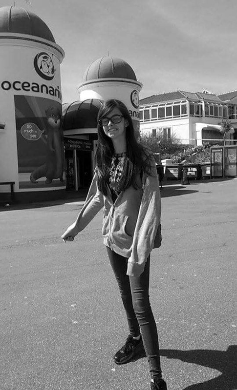
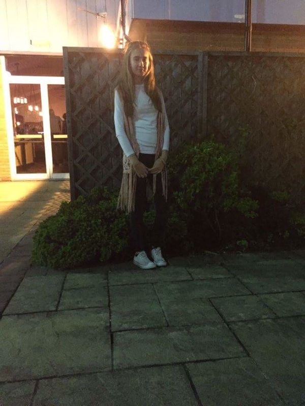
photo shoot 2
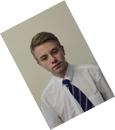
photo shoot 3
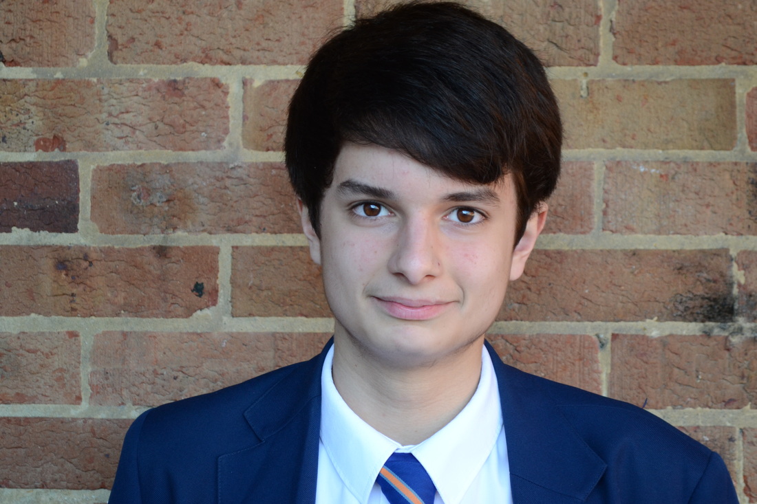
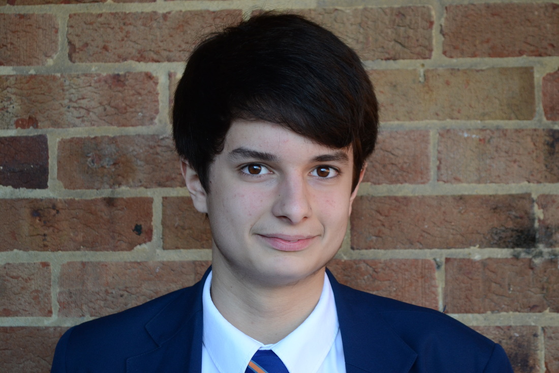
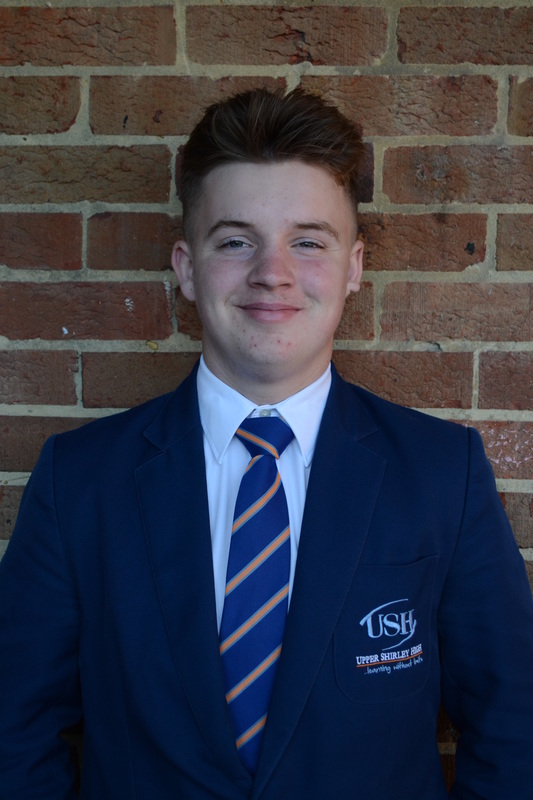
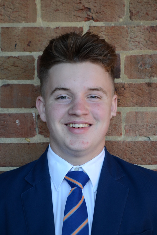
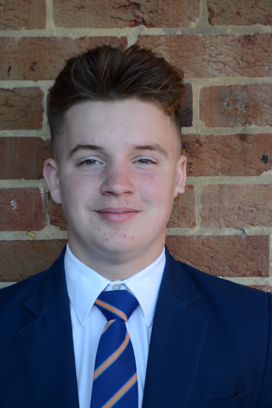
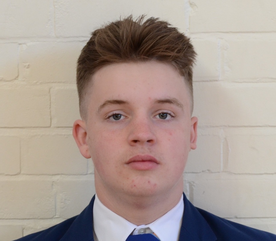
photo shoot 4
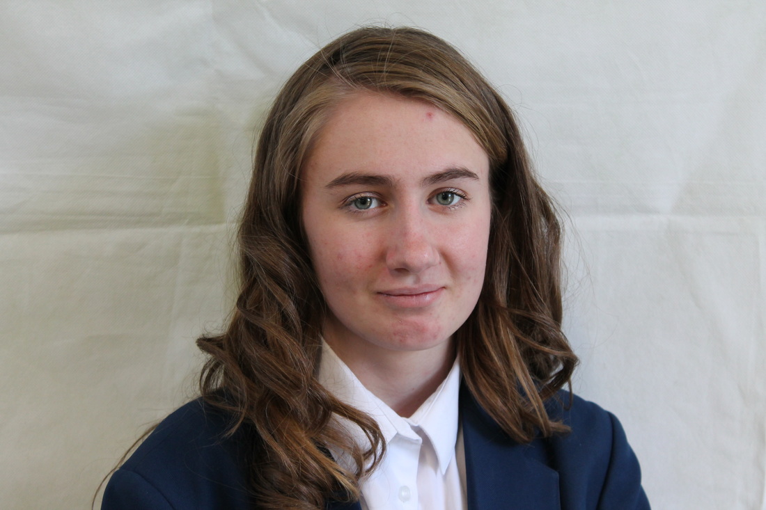
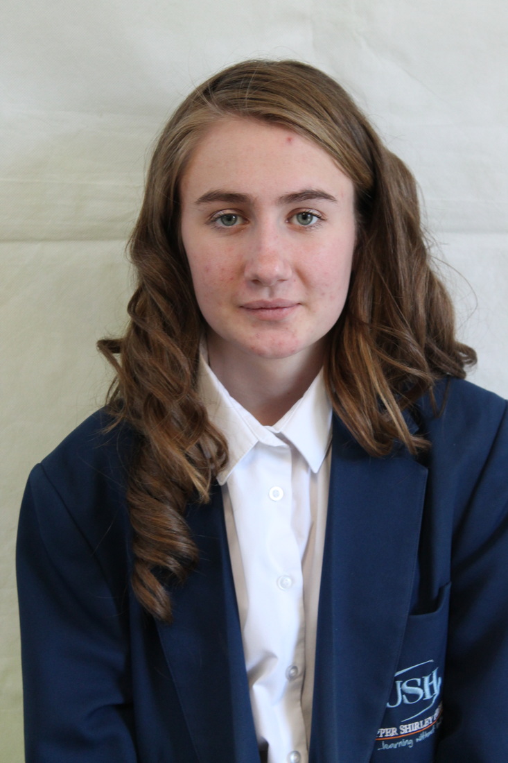
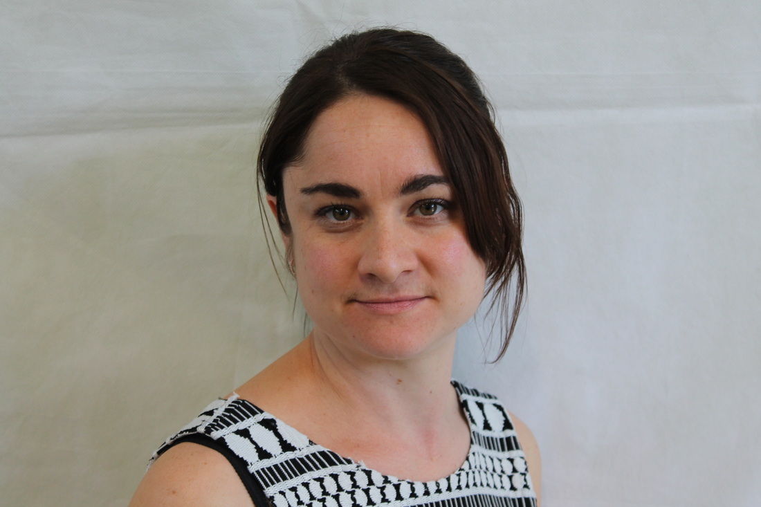
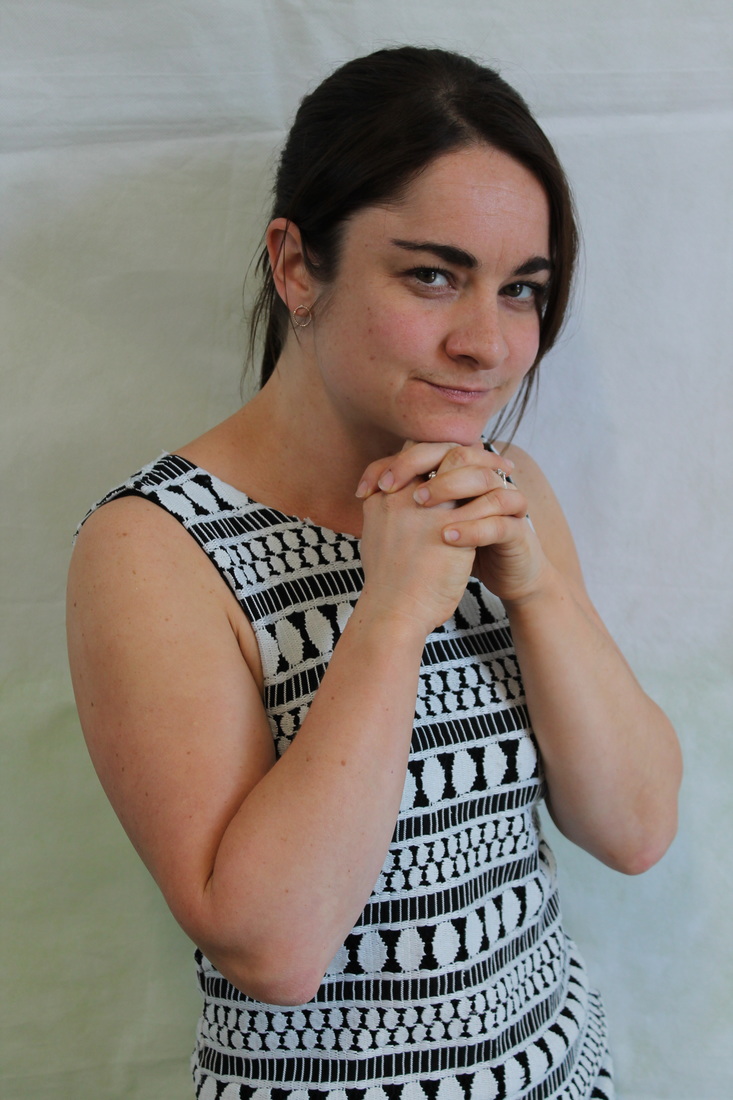
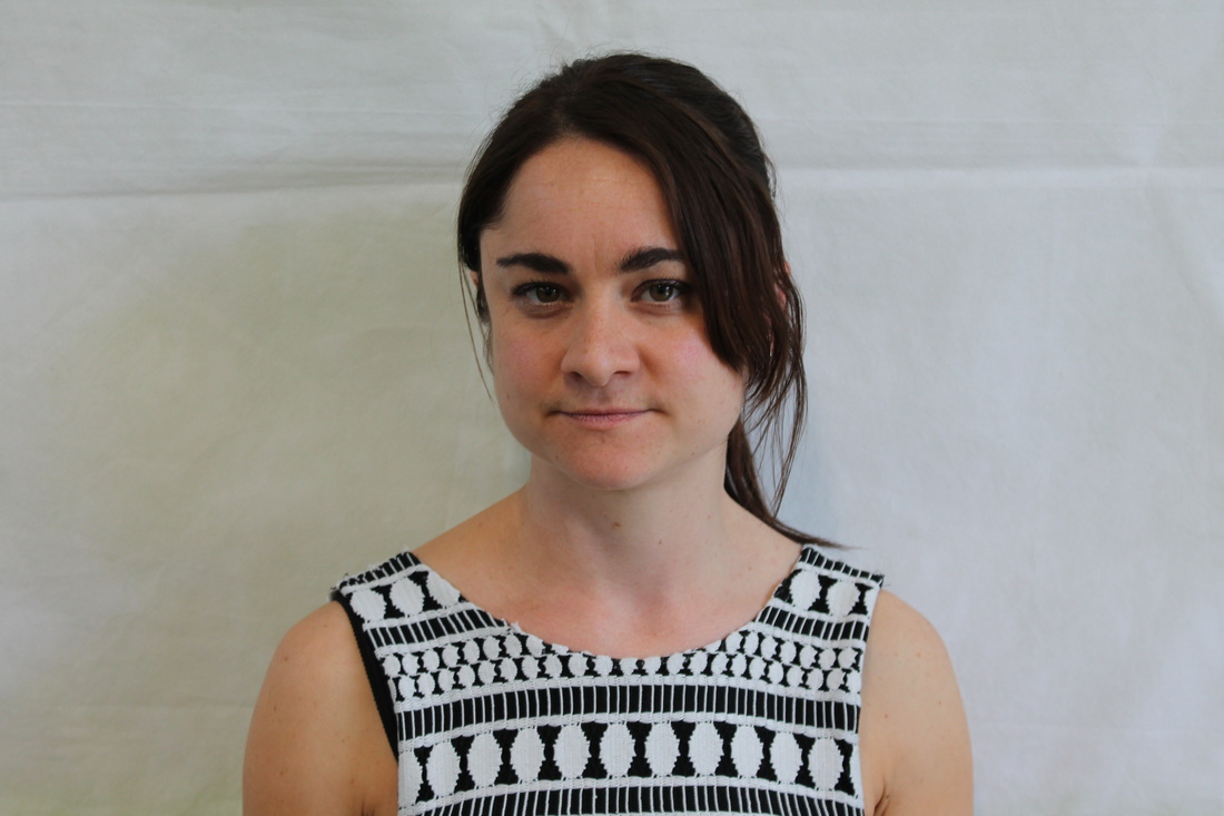
photo shoot 5
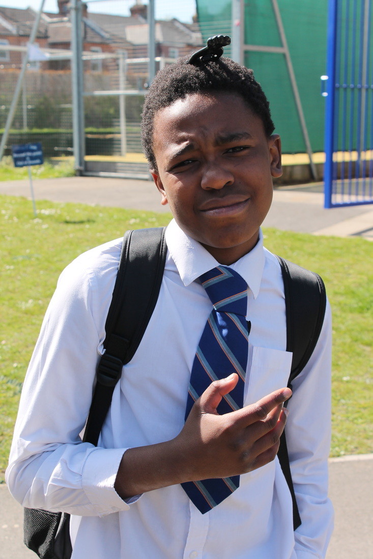
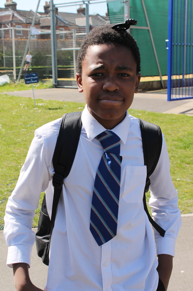
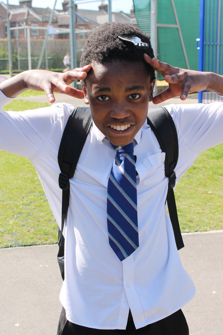
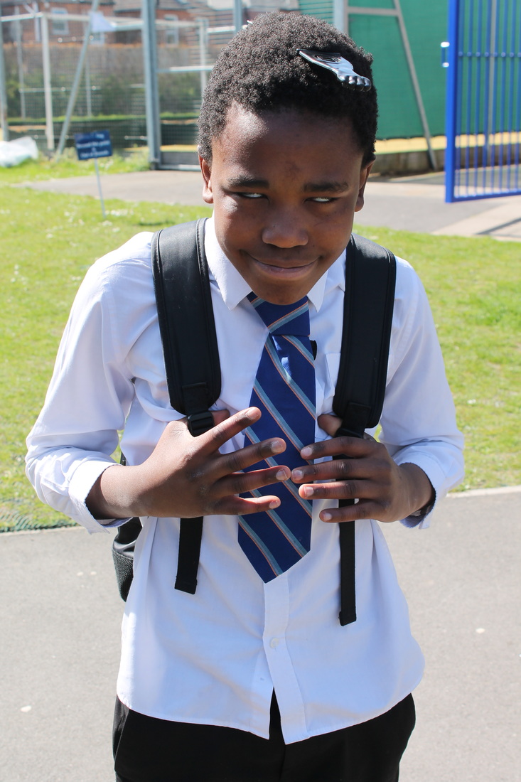
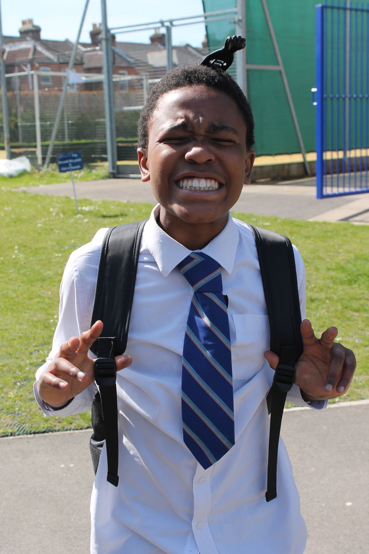
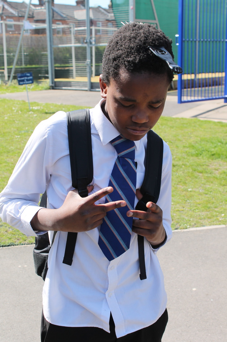
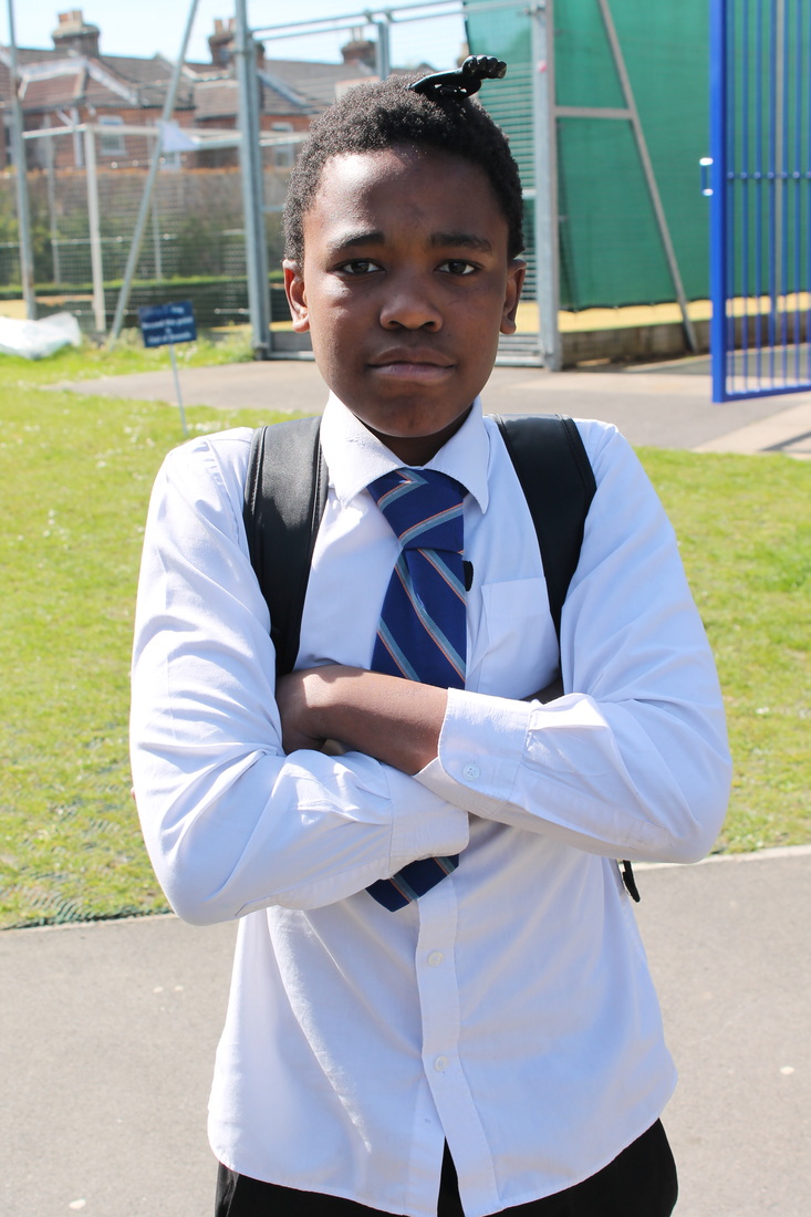
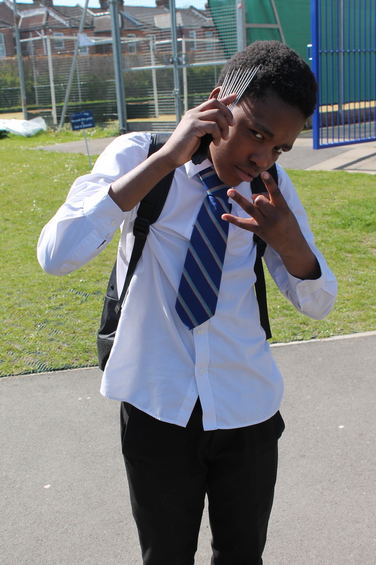
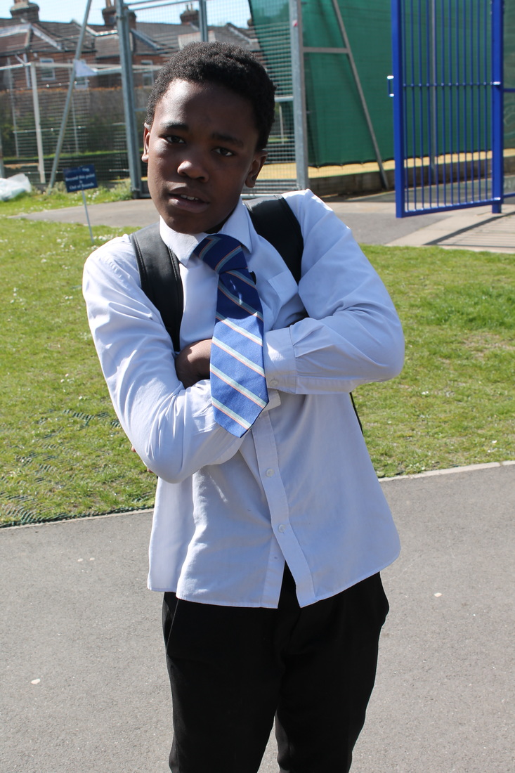
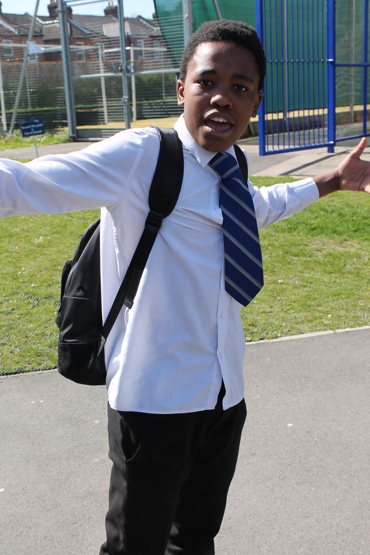

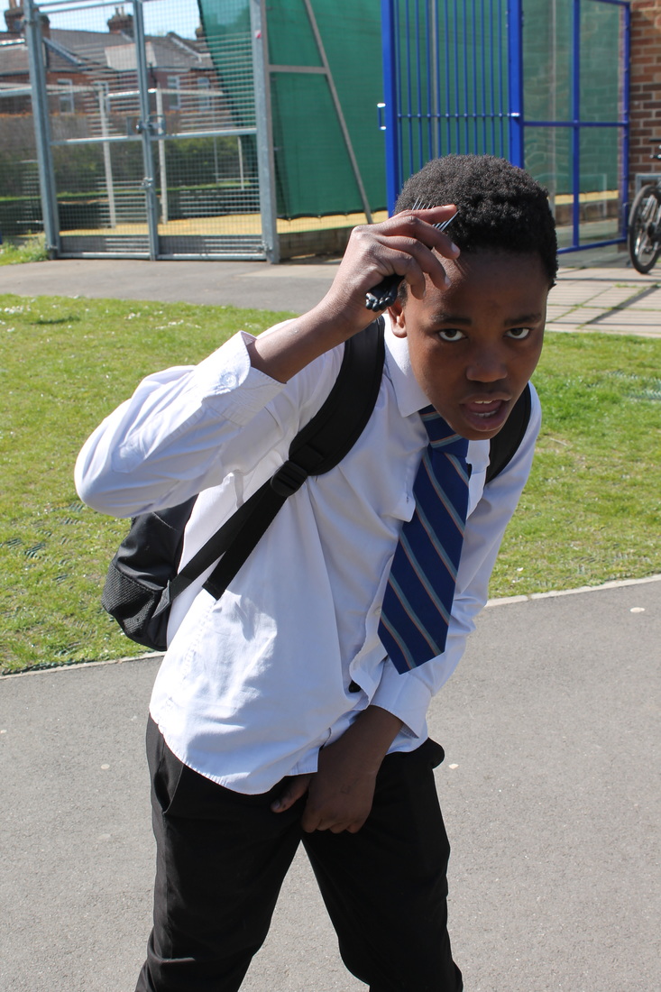
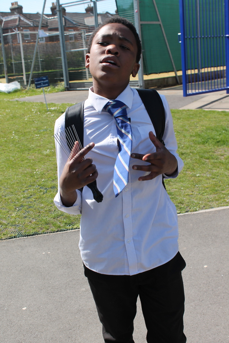
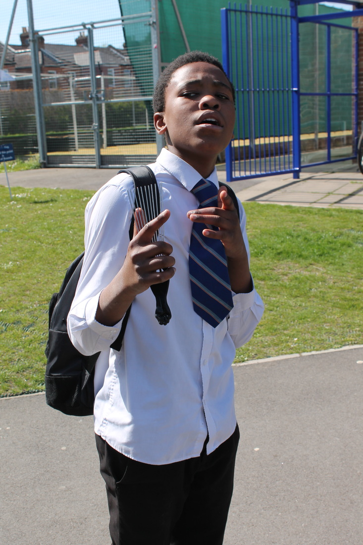
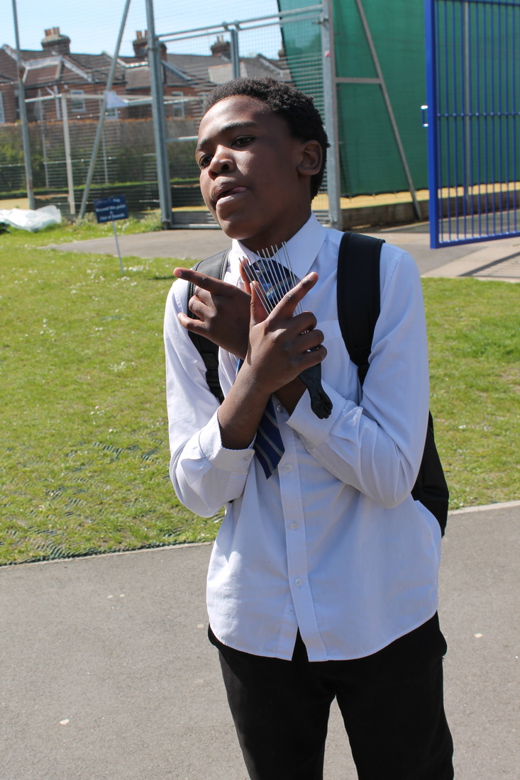
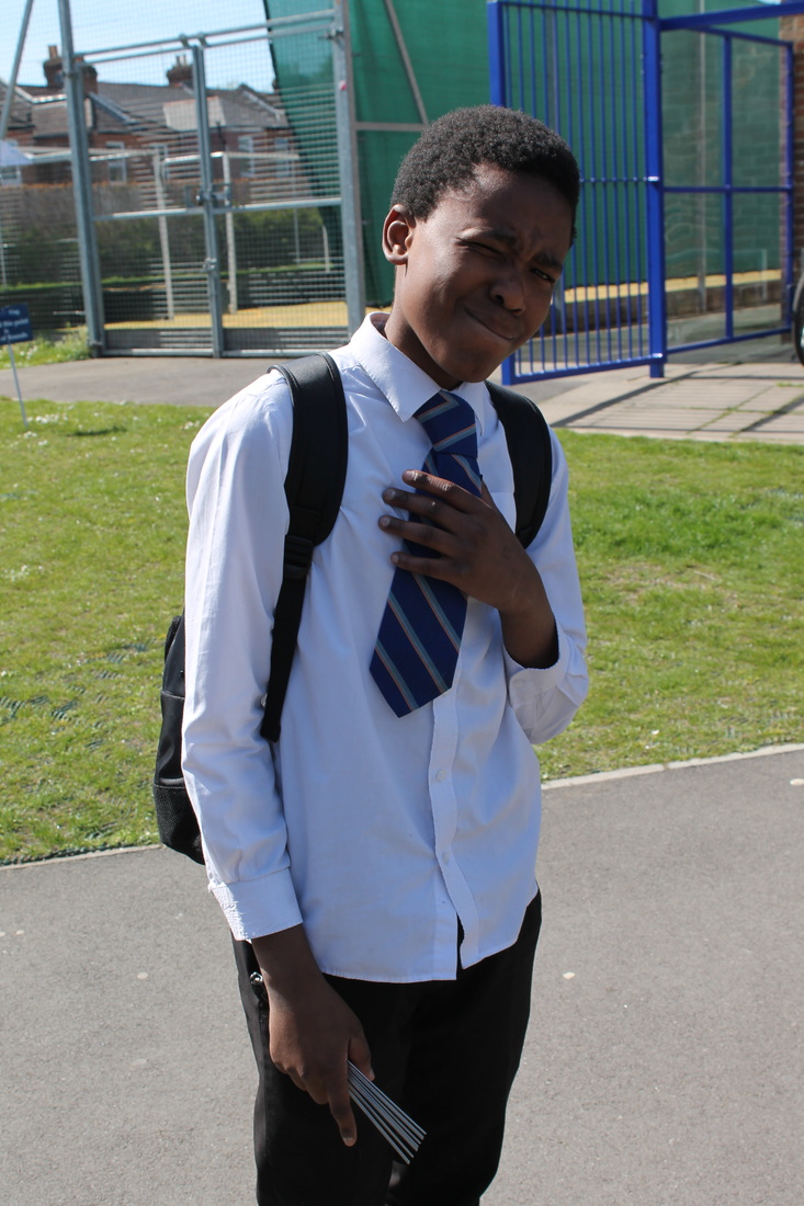
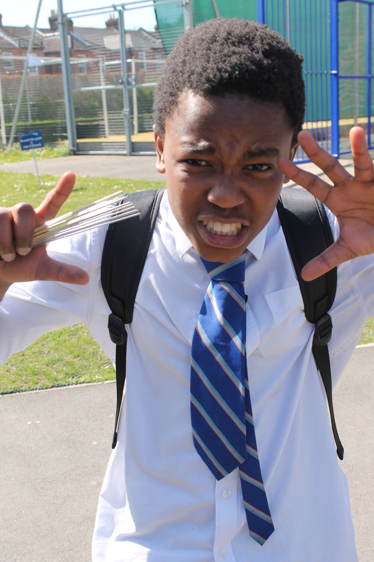
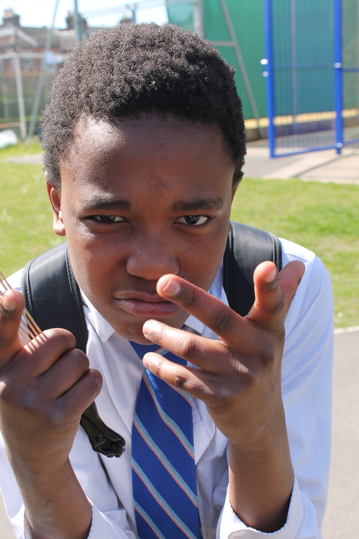
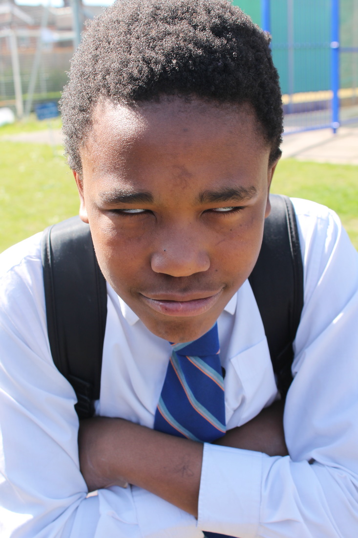
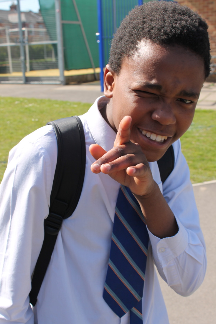
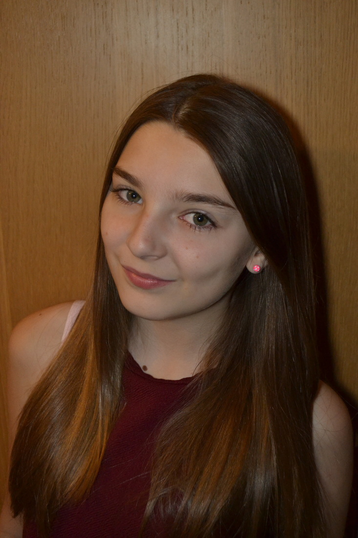
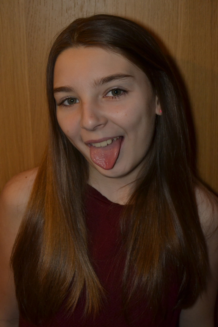
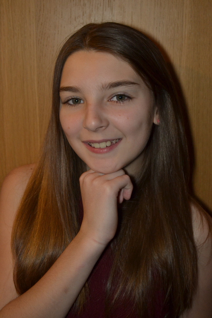
When trying to recreate Rankins photography I used natural light and in some a basic background this created a shot which focused on my subject which made this a good portrait shot. We used the same sort on posses as Rankin uses to recreate that image.I can improve these images by going into Photoshop and turning down the contrast and on some put the image into black and white to give it a serious and create more focus on my subjects.

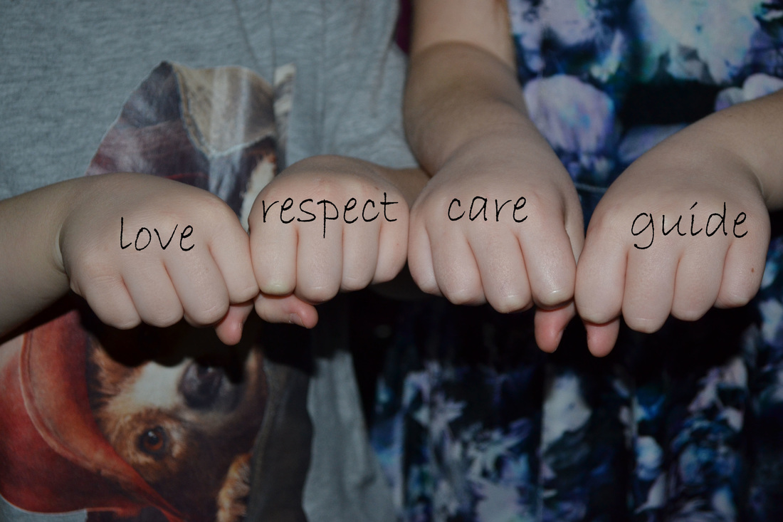
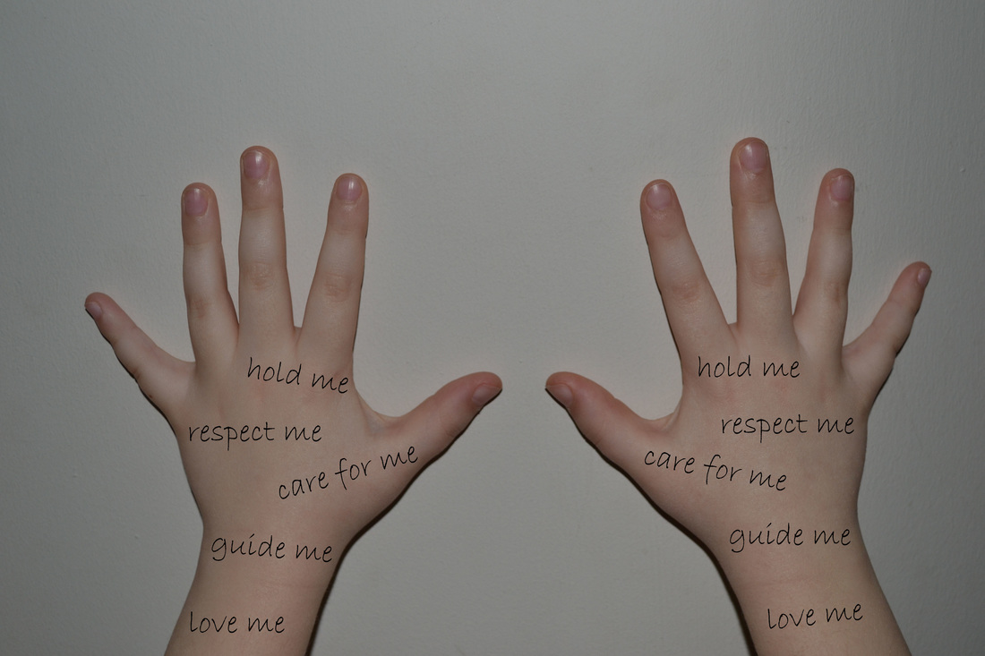
stefan-sagmeister

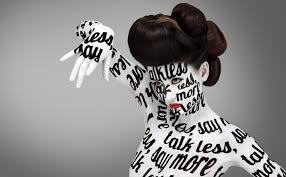
Sagmeister studied graphic design at the University of Applied Arts Vienna. He later received a Fulbright scholarship to study at thePratt Institute in New York. He began his design career at the age of 15 at Alphorn, an Austrian Youth magazine, which is named after the traditional Alpine musical instrument.
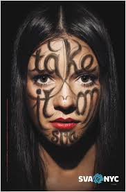
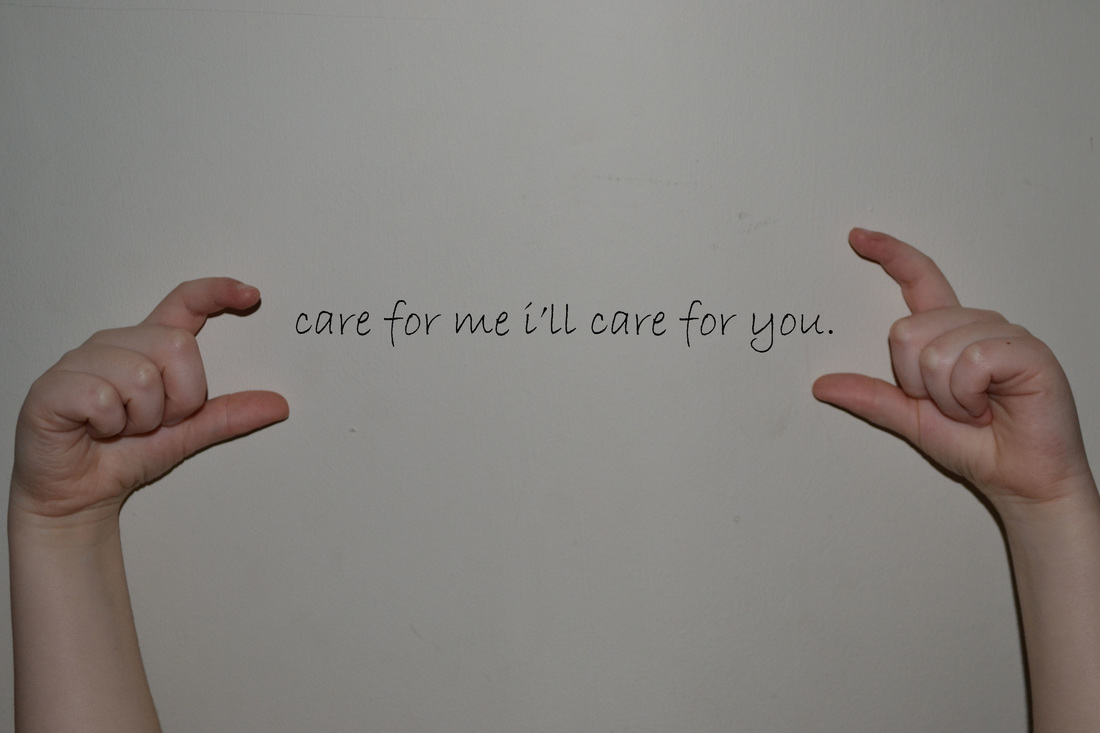
my response to his work.
|
|
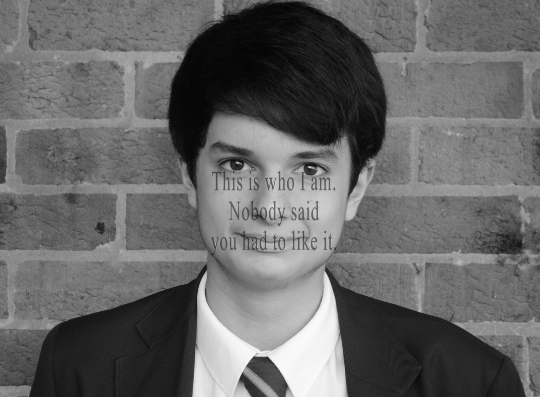
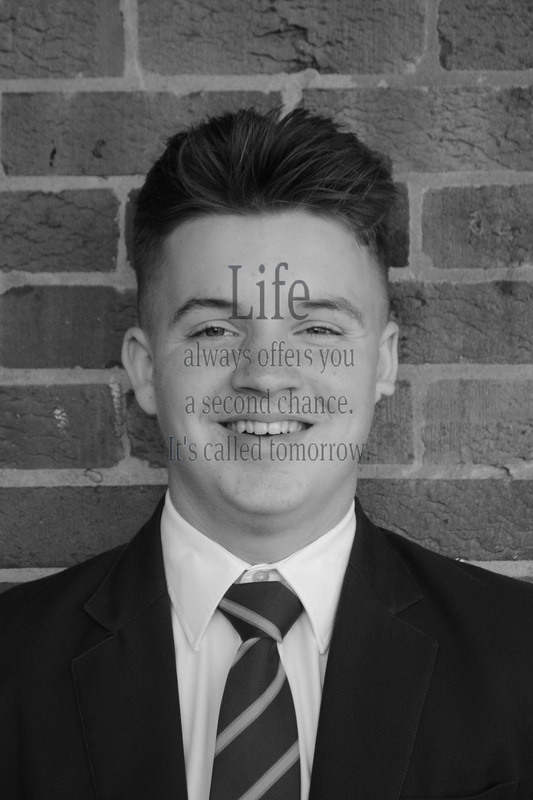
In these images i used Photoshop to put the words over the body and on the walls. I also used Photoshop to edit some of the images into black and white to give my a more serious and meaningful effect to bring out the different feelings in my photos.My Favourite photos are all the black and white ones because it really gives out the messages im trying to give out .Lastly it allows the words blend into the images a lot better then if it was in colour.
|
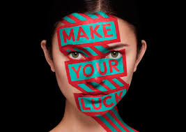
final piece
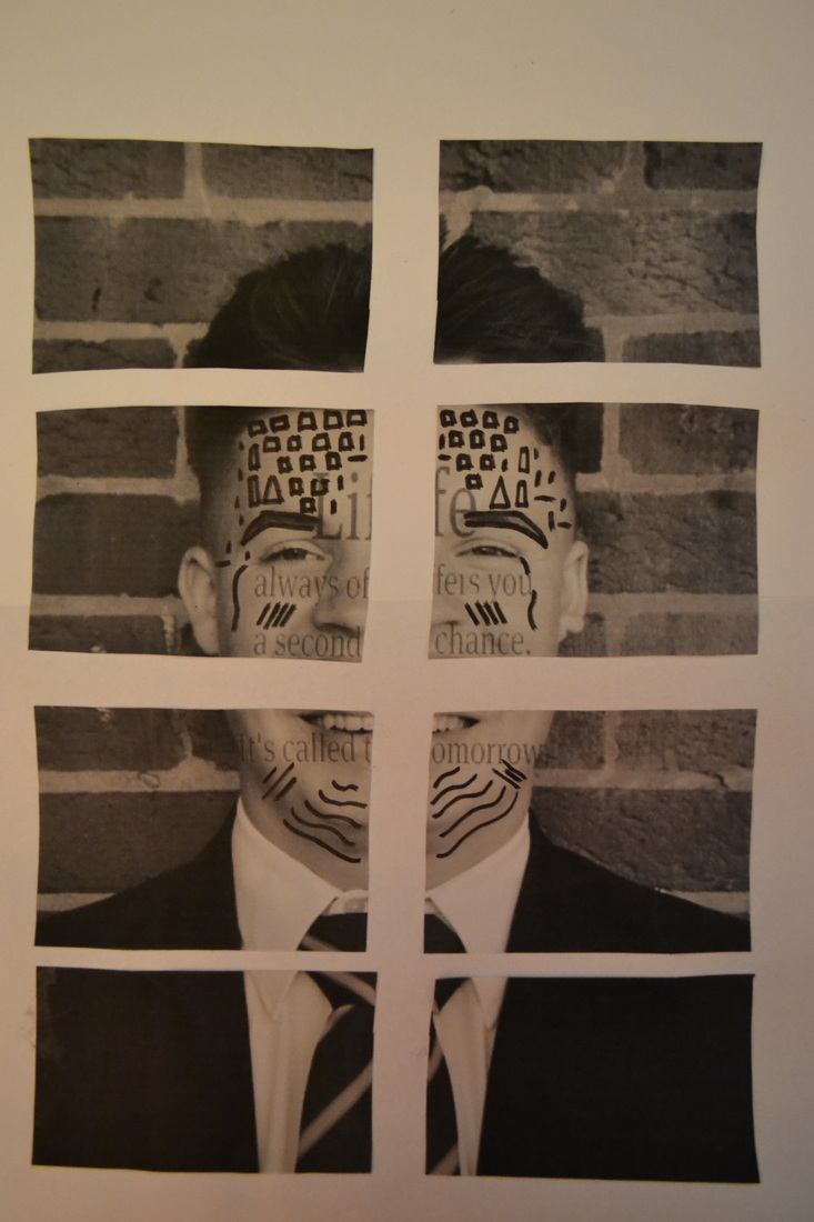
with this image i have mixed two photographers styles of work firstly Rankin destroy and secondly stefan-sagmeister. I have chose this a my final piece because i like that the two photographers work has been mix which makes this image very different to all the work i have produced.I then made even more improvements by adding the work of Nina chakrabarti where i draw patterns onto the subjects face.
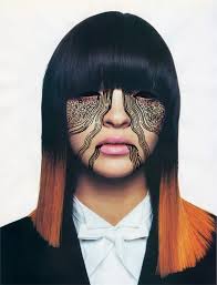
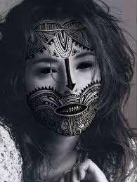
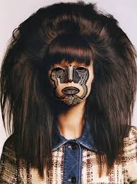
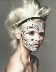
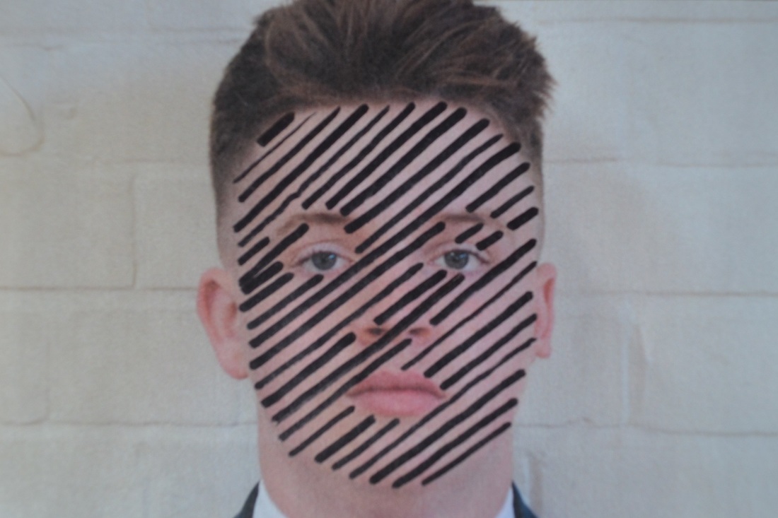
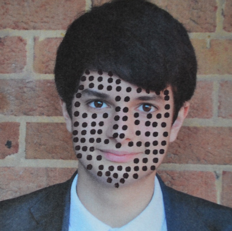
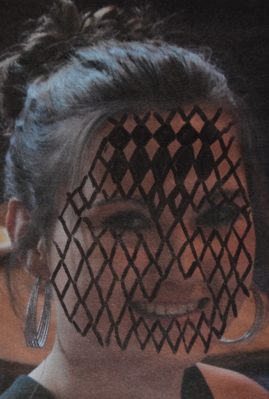
nina chakrabarti
Nina Chakrabarti is a London based illustrator, She was born in 1970 in Calcutta,India.She achieved a Bachelors degree in Central Saint Martins and a MA in the Royal College Of Art. Although she grew up in Calcutta in the 1970s her mother was English so she was exposed to lots of western books, music and art as well.Nina Chakrabarti's illustrations are quite simple. With just a few pen strokes she finds a way to put a sense of joy and wonder into her drawings. She is highly inspired by fashion and this lead to the creation of her 'My Wonderful World Of Fashion' books.
|
I have printed my photos out and used a black pen the draw the design on top of the faces which when i finished i scanned the photos back onto the computer which i would crop and edit things i disliked.I stayed using a black pen because this is the colour this photographer uses and i wanted to show that in my examples of her work. To improve my images i could use more complicated designs and more of a verity to represent her work into mine. My Favorited design is the horizontal lines on my subjects face.I like this one the most because having a white background really makes the lines and my subject stand out which i did attempt to do in this image.
|
    |
My final pieces

i pick these images as my final edits become the worlds are made to suit the identity of the subject.This created a deeper meaning to the photos.I also picked these because they relate to what the photographer stefan-sagmeister what trying to create in his photography.
evaluation of the identity project
my favourite part of the identity project was the Rankin destroy. This was because i enjoyed playing around with parts of the photo to create something completely new.I also had some dislikes to the project.I dislike the stefan-sagmeister writing on the face because i found it hard to think of the words and phrases to write over my subjects.Overall i have enjoyed the identity project because i had the chance to have a go at photography i do not normally do.
